Interfaces, icons, characters, logos. The smallest pieces of the work.
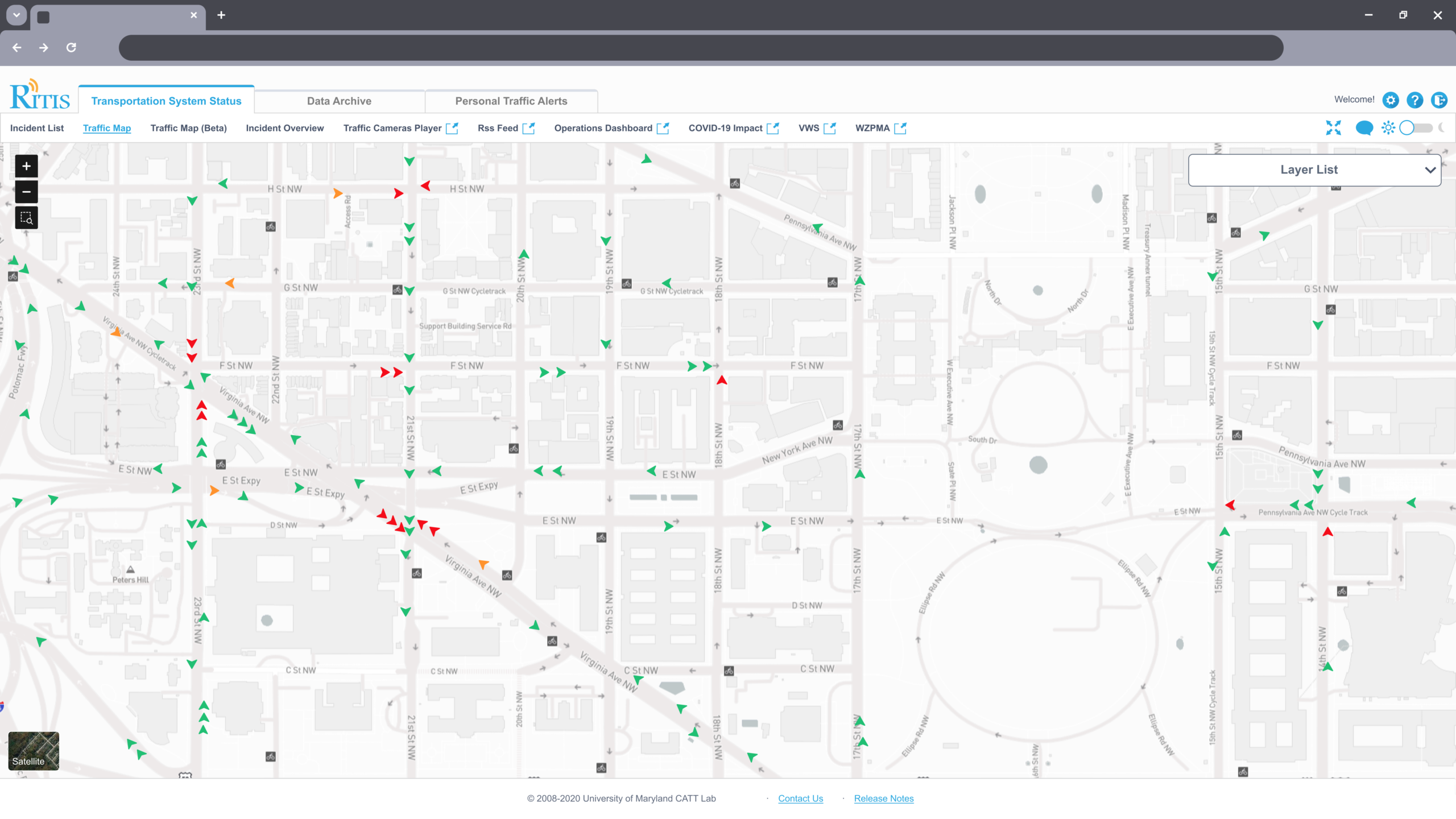
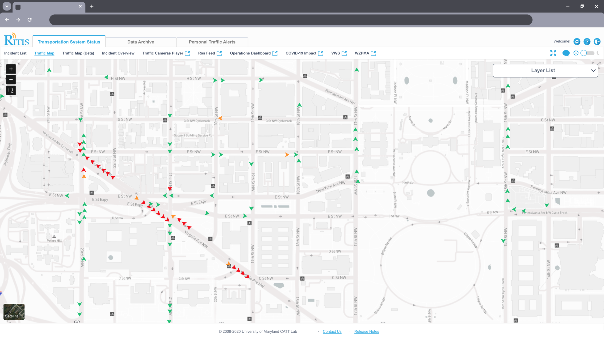
Step 1: The Atom. A collection of 17 design artifacts showing breadth across product interfaces, VR environments, 3D modeling, brand identity, illustration, and interaction design. Work spans RITIS transportation platform, Away-sis VR meditation, Ssongs food ordering, Bao Festival, Cloudlytics, and PDA Suite.
02
Step 2
The Pattern
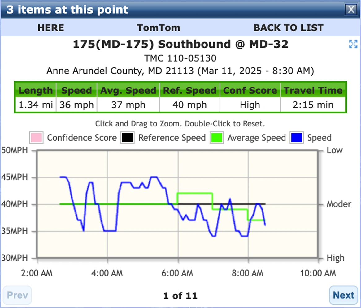
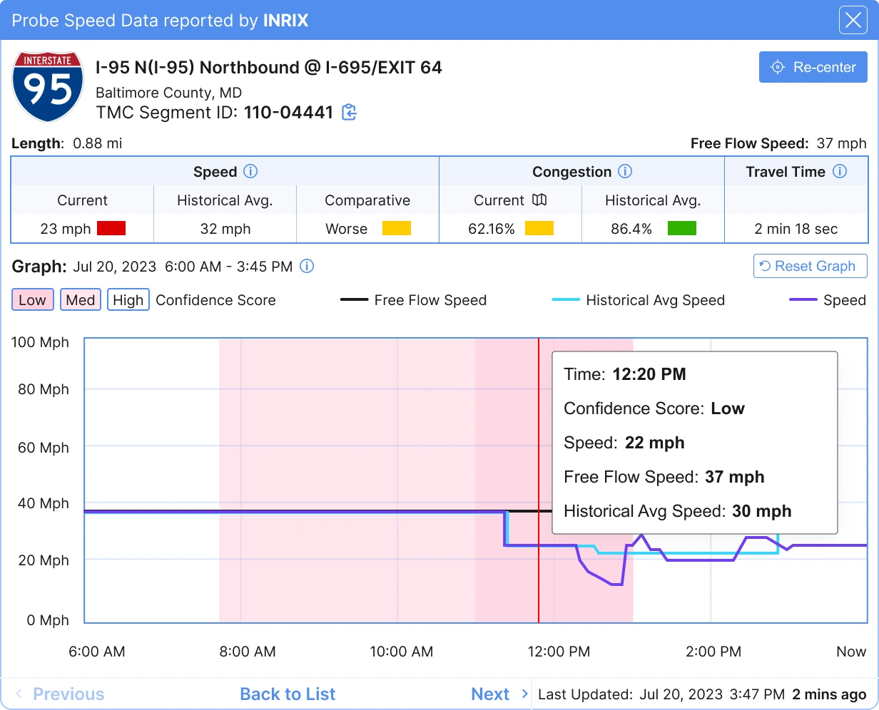
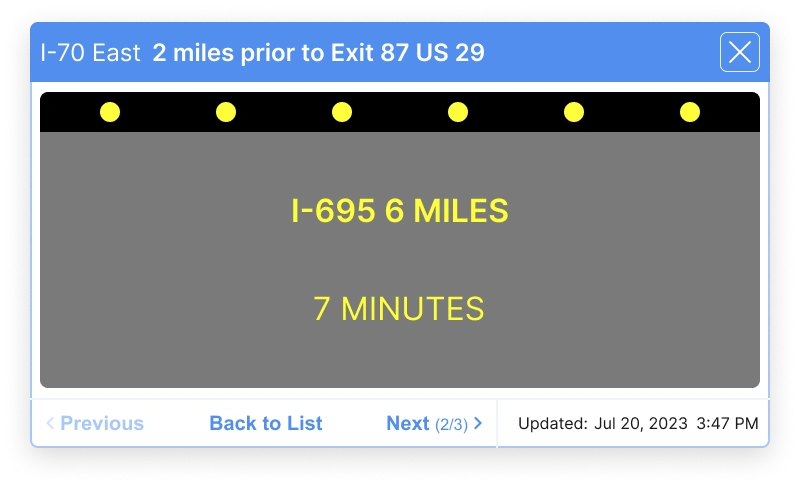
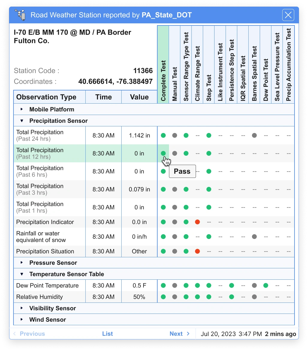
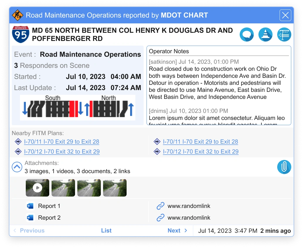
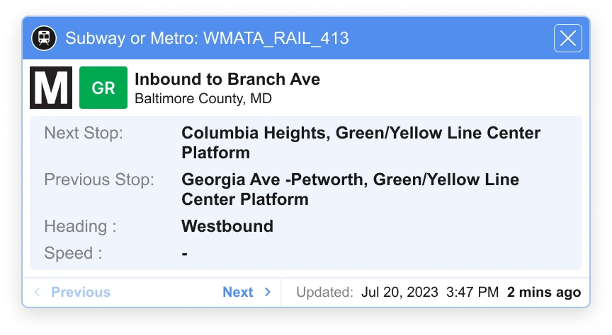
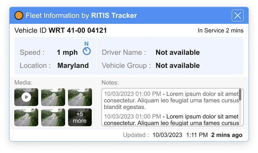
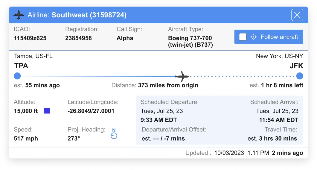
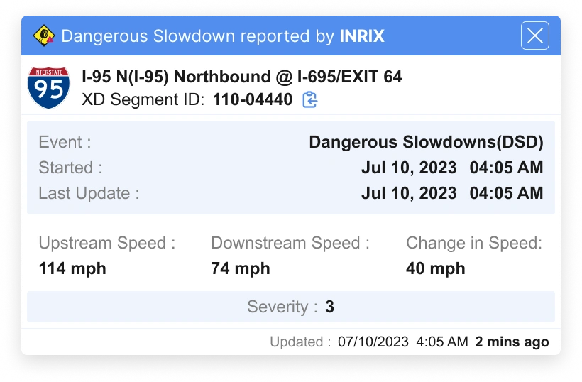
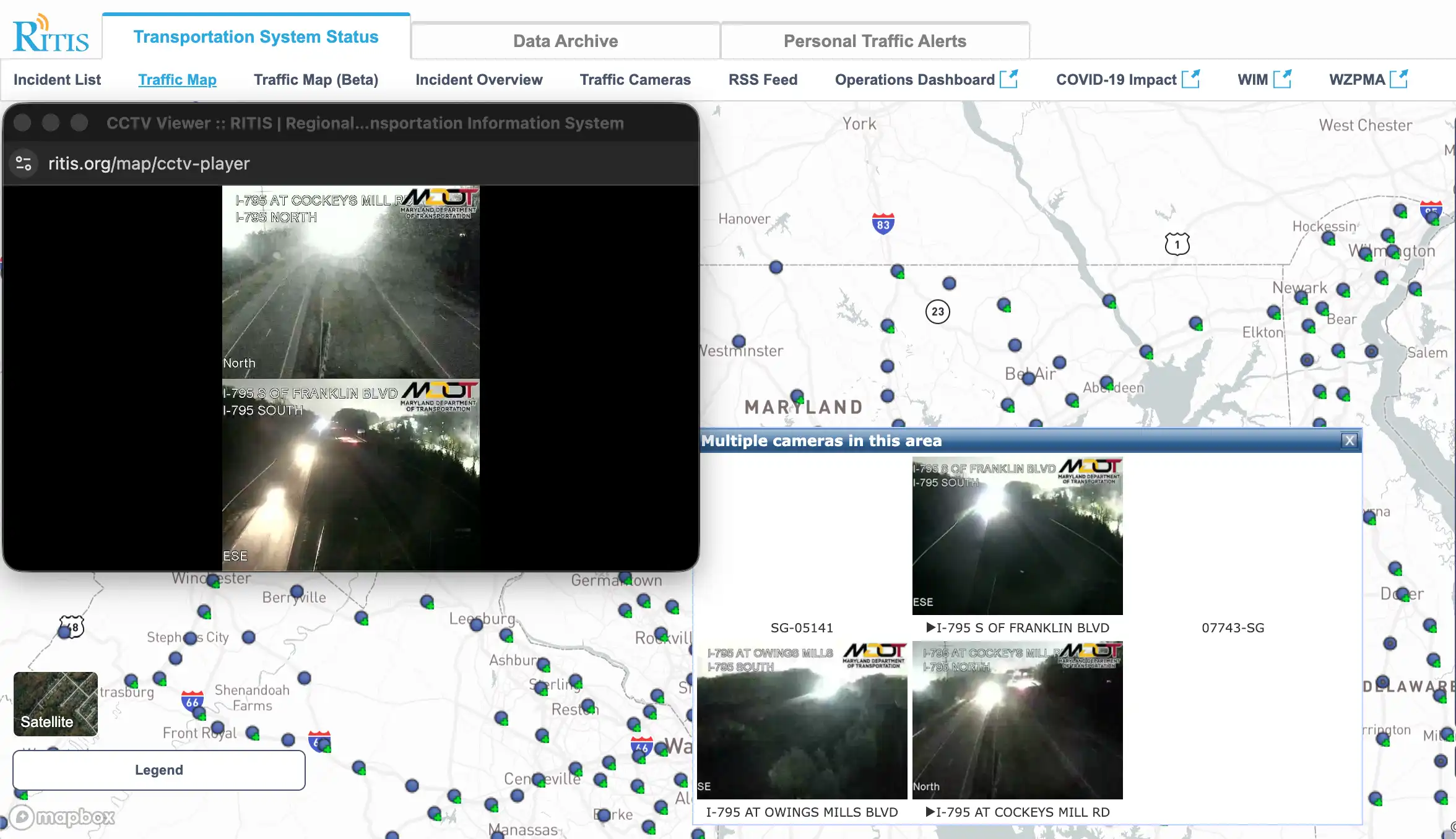
Every popup on the platform was built ad-hoc. Different layouts per layer. Inconsistent data hierarchies. No shared components. Users screenshot these popups for their reports.
I identified common elements across fifty types, built a coherent system across nine data layers, and established patterns that made every new data source faster to ship.
Compare
50+ popup types · 9 data layers · One system.
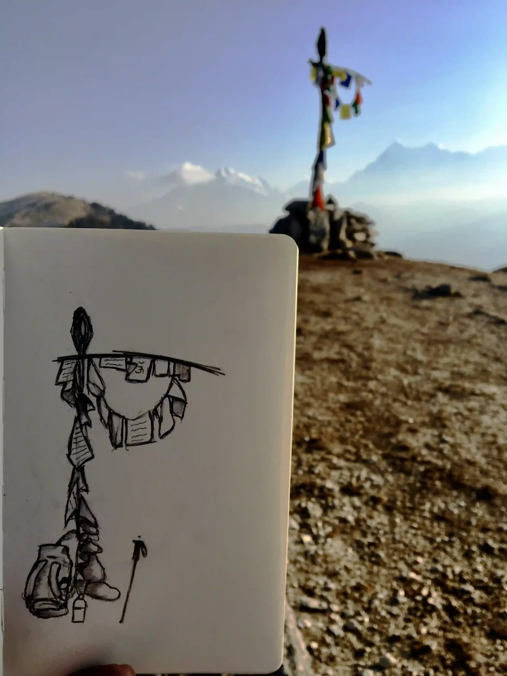
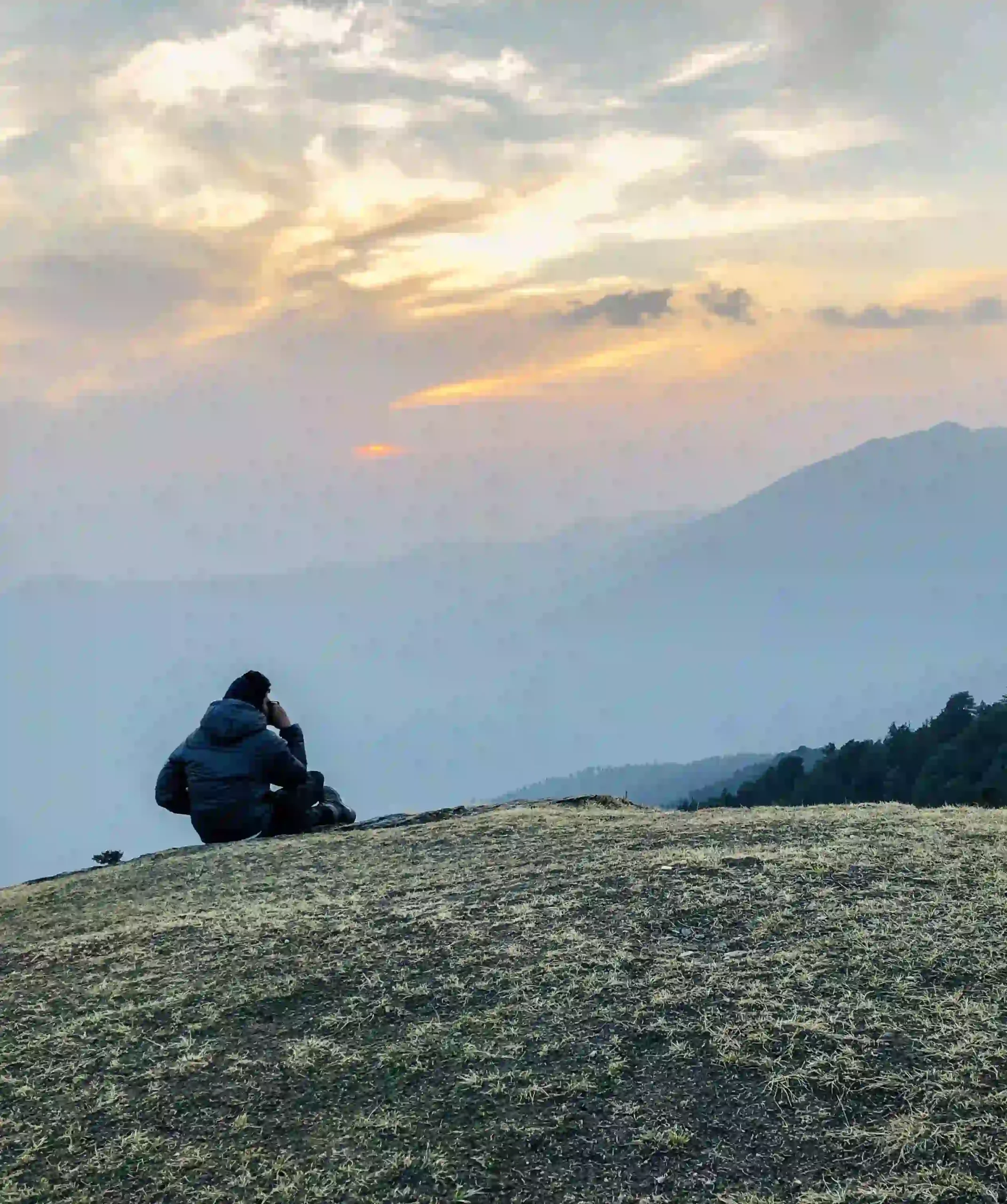
I sketch to think, play football to not think, and measure coffee extraction like it's a design variable.
03
Step 3
The Feature
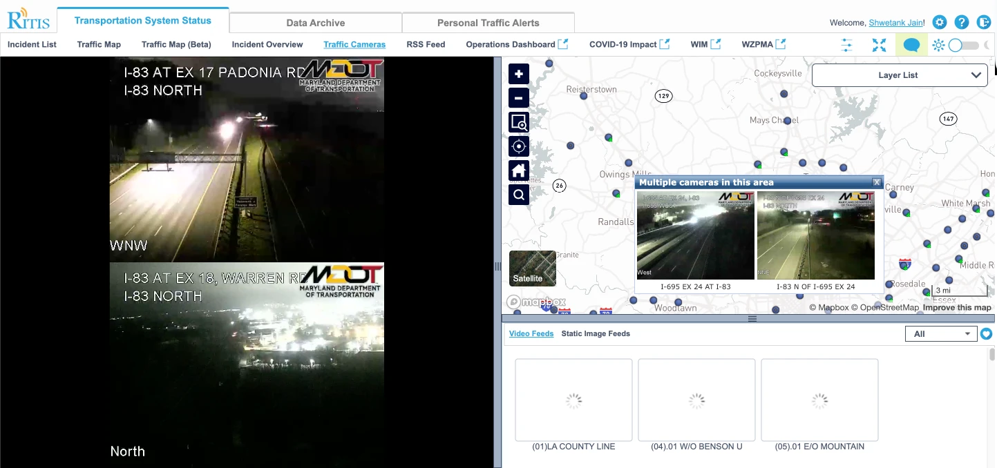
Two tools. No connection between them.
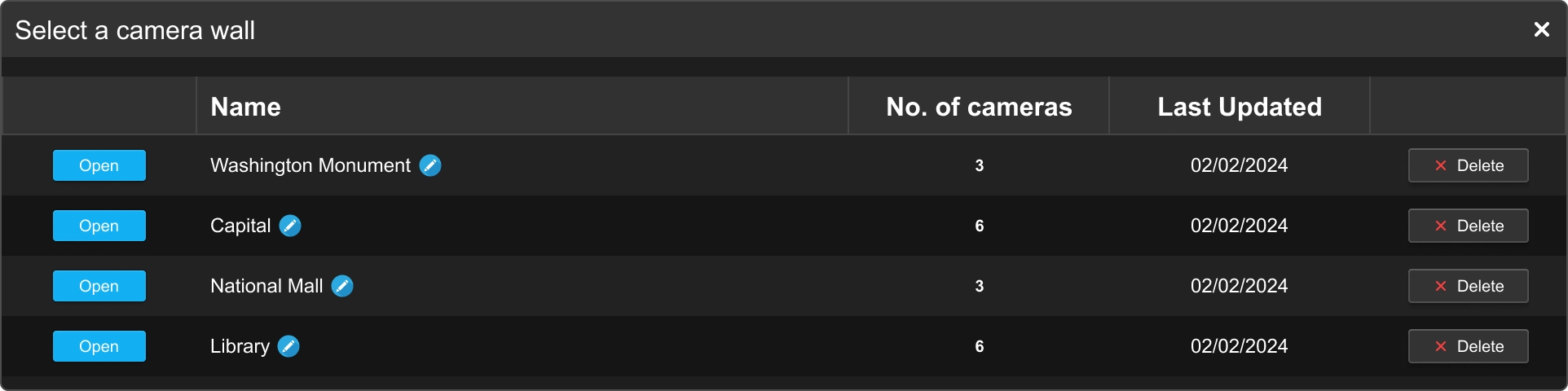
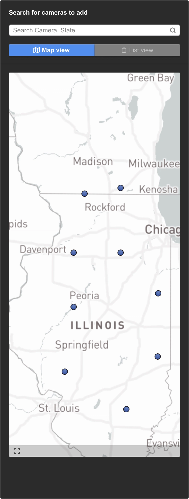
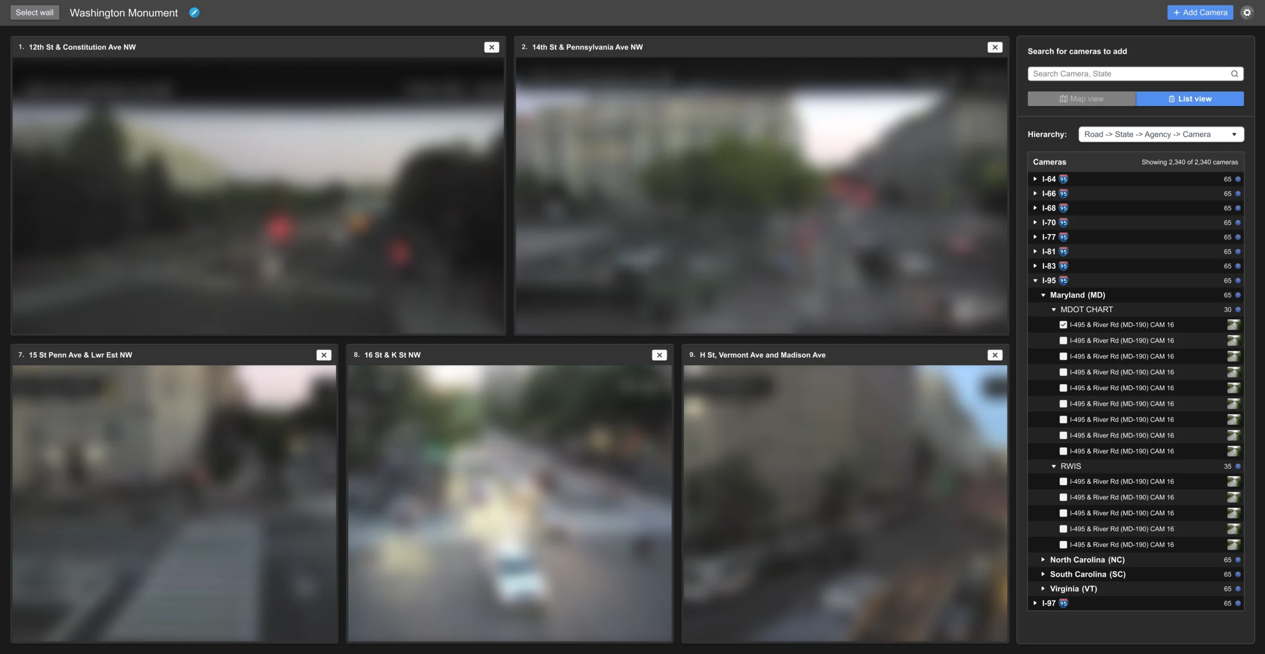
Two tools for 2,340 cameras. Neither saved your layout. I watched operators work, then designed the wall they could build, name, and keep.
Build a wall. Name it. Come back to it tomorrow.
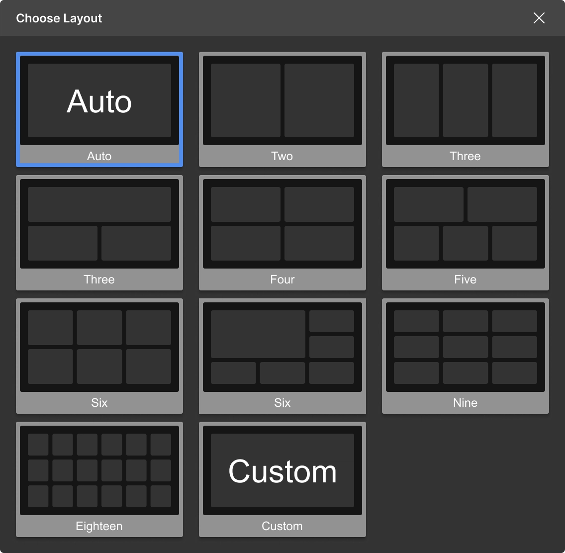
Same wall, different density. Six cameras or sixty.
List. Search. Map. Find any camera three ways.
reading Articulating Design Decisions · watching One Piece (ep 1,089) · brewing Yirgacheffe 15:1 · playing Sunday league, right back
04
Step 4
The Product
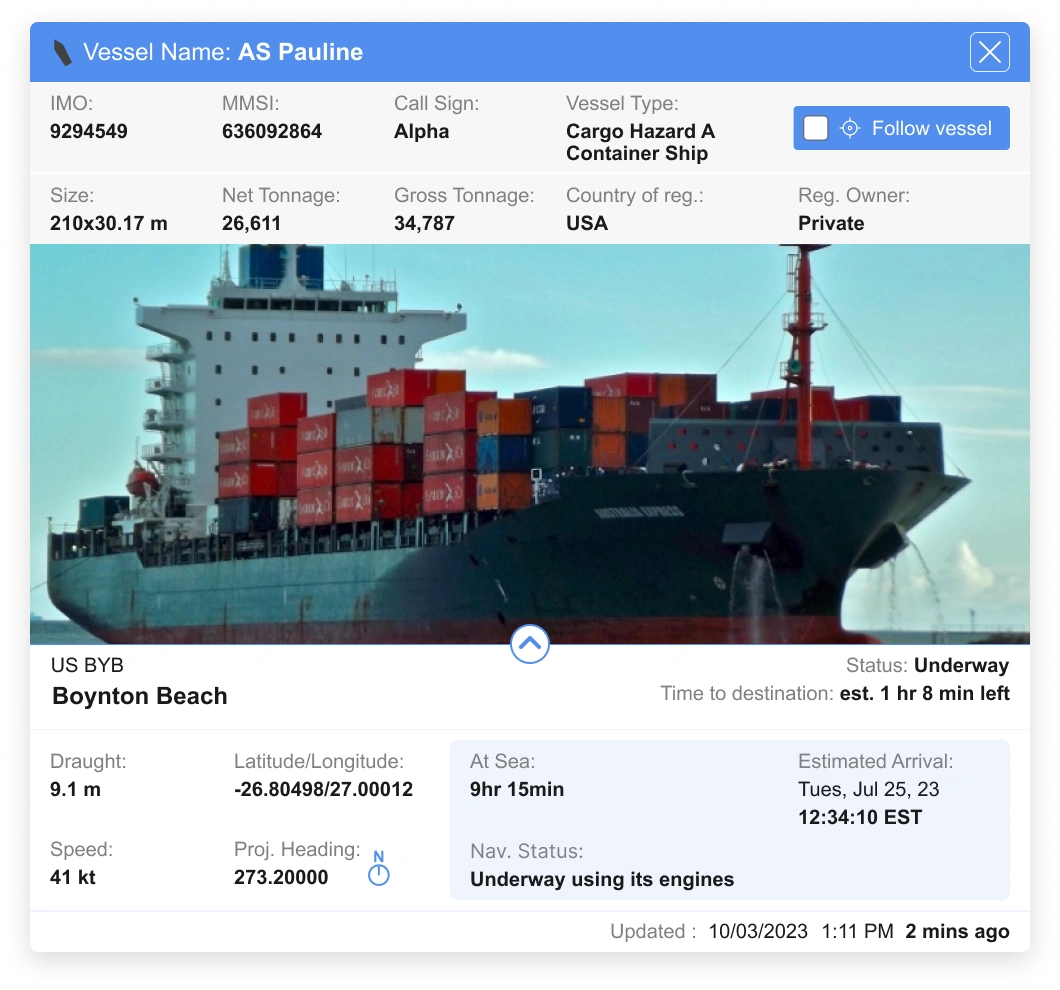
Vessel data existed but no one could see the full picture. Port authorities needed real-time movement patterns, dwell times, and throughput in a single view.
I designed the analytics dashboard they use today. Live in production. Presented at TRB 2025.
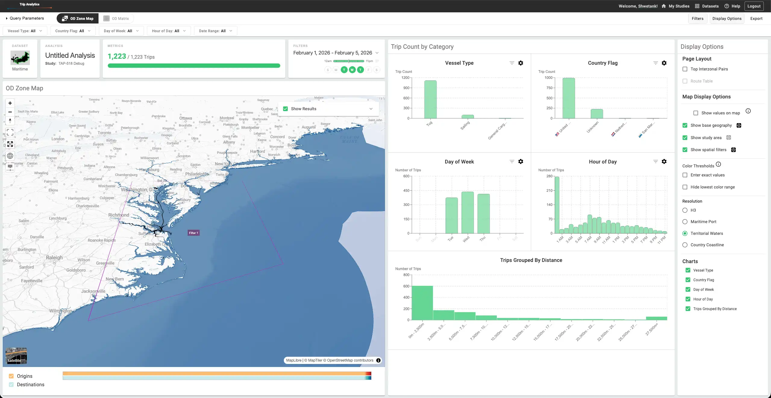
Analytics for vessel movement: where ships go, where they wait, and what they pay to avoid a queue.
Maritime Trip Analytics, 2024
01
Hex bins, not route lines
Roads give traffic a fixed width; ships follow currents and common paths. I pushed for hex bins over route lines, and the team adopted them. They hold up from a single port to the whole globe.
02
Bin size, separate from zoom
Our tools clustered by zoom: zoom out for the big picture, zoom in for detail. I made bin size its own control, so at the same zoom analysts see both the overall routes and the detail inside them.
03
Filter the result, don't re-run the query
Our tools had you describe a query, then run it. Adding one day meant starting over. I pushed the PM and stakeholders for live filtering, which maritime needs and other datasets can use too.
04
A "through" filter
The job is finding the best route, and chokepoints decide it. If the Panama queue runs 5 to 10 days, a ship might arrive sooner another way. "Through" finds every vessel that passed a region, so analysts can spot delays and compare alternatives.
Tradeoff
Extra work, with a fallback
Live filtering meant more work for engineering. I kept a version without it ready in case stakeholders said no.
Outcome
The default result page for the suite
Trips used to answer a query with a page of charts. The dashboard I designed, live filtering included, now serves every tool in the suite, from vehicle data to truck parking.
Built for water, not roads
Four design decisions behind a maritime analytics tool
Ssongs
Browser-based ordering that removes the queue and adds a weekly game. No download. 84% of testers preferred it.
Away-sis
VR meditation for ChristianaCare caregivers, designed for the way out as much as the way in. Stress measured through biosignals, not surveys.
Maritime · Historic analysis for vessel data
At the lab I move across products, some end to end, some feature integrations. I'd brought vessel data into RITIS, our live traffic platform, so I took on its historic side too.
Problem. Trips, the lab's historic-analysis suite, answered a query with a page of charts. There was no dashboard and no shared structure, and the suite looked nothing like the rest of the lab's products.
Decisions.
A dashboard, not a chart page. I introduced a dashboard system as the result page, with its own structure and design language.
Use the rebuild. Every product was moving to React, and I'd redesigned RITIS, where most of my work is, in that same rebuild. It was the moment to redesign trips too.
Prototype the argument. Stakeholders agreed to a separate bin-size control after seeing a prototype of it working at the same zoom level.
Structure devs can run with. Engineers worked with the PM and stakeholders to add what they needed, without design in every step, and the system grew with needs and budget.
Tradeoff. Engineers working on their own meant some things shipped that design never reviewed, and color was never defined as a system. The suite color palette is my current ticket.
Outcome. Hex bins spread to truck parking, where the problem was hiding exact vehicle positions. Maritime had already built and tested them, so they were an easy sell. Next: a view to compare time periods with identical settings, without rebuilding the analysis.
Web application · 3 to 4 months · Designed end to end
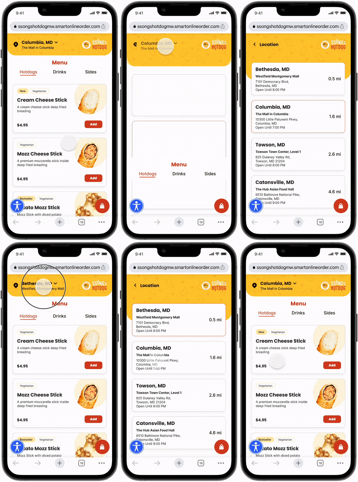
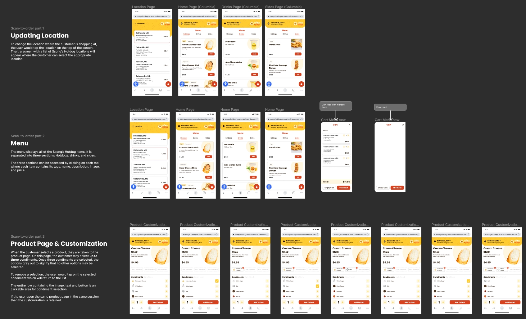
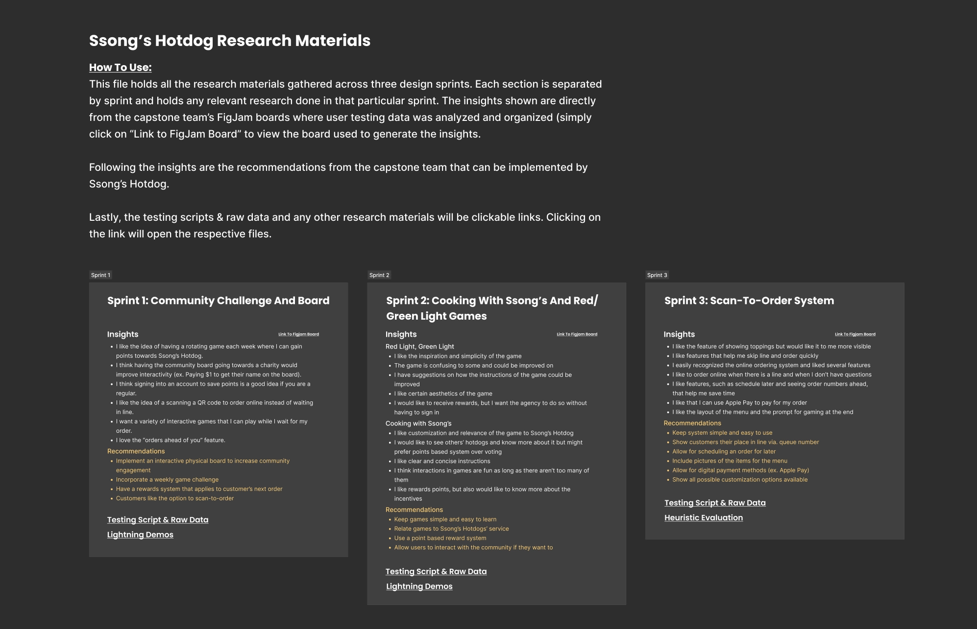
Ssongs · Ordering for a Korean hotdog shop
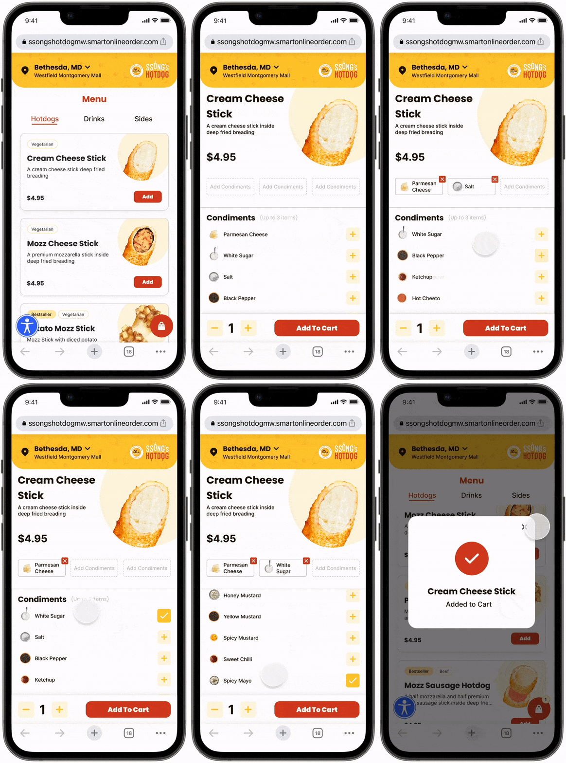
A browser-based ordering app that removes the queue and gives the wait a purpose: a weekly game with rankings and rewards. No download.
Problem. At a food court you queue to order, struggle to find a seat, and have nothing to do while you wait. Tablets at the counter don't fix that.
Decisions.
Scan, don't install. QR ordering in the browser. Nobody wants to download a hundred food apps.
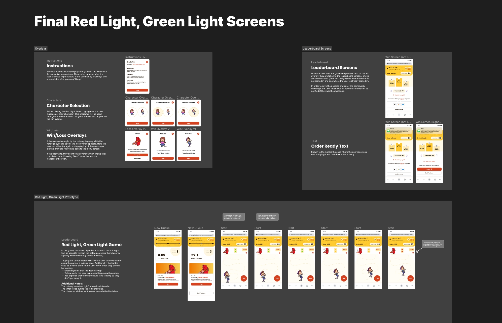
A weekly game. Three games rotate each week, with rankings and rewards for the top 3. The team made three; I made one myself: Red Light Green Light, themed on Squid Game, which was everywhere at the time and fit a Korean shop.
Customization you can see. Picking options visually instead of from words made custom orders easier.
Tradeoff. A game that holds your attention can make you miss your order. So the live order timer and a ready notification stay on top of the game.
Outcome. 84% of 19 test participants preferred it over the existing process. 31 heuristic issues found across 5 sprints in 7 months. Delivered with a style guide and component library.
Most meditation apps focus on getting in and staying in. Away-sis also designs the way out.
Problem. Guided meditations open with a relaxing voice or sound that fades away, then end with an abrupt voice announcing it's over.
Decisions.
A sequence for every sense. Day slows into night, then into a state with all color removed. Sound starts natural, gains birdsong, then instruments.
Breathing you can see. In the colorless state, a colored breathing cue gradually brings the respiratory rate down.
A way back. Sound fades in and out as color and night birds return, then morning birds bring you out.
Start with a look. The first version needed a controller to begin. We replaced it with a bubble you look at for a few seconds.
Measured live. The headset tracked respiratory rate, heart rate and other signals, and showed a live graph of the wearer's cognitive load as it changed.
Tradeoff. It was a short project: a home space and one meditation space. We modelled everything in the meditation space and some of the home space, and took the rest from online libraries, so the two share a theme but not an identical style. I modelled a panda spirit animal in Blender, but its interaction didn't make it in.
Outcome. Tested with 40 caregivers, including doctors and nurses. Most liked it, but not everyone was ready to adopt it straight away; gradual exposure would have helped. Over 20 days of our own recordings, cognitive load dropped gradually.
Unity + HP Reverb Omnicept G2 · Built for ChristianaCare, one of the largest health systems in the US
05
Step 5
The Invisible Layer
The previous four steps showed work you can see. This is the work you'd miss. The thinking behind shipped products, the case made for new ones, the systems that let other people build.
define
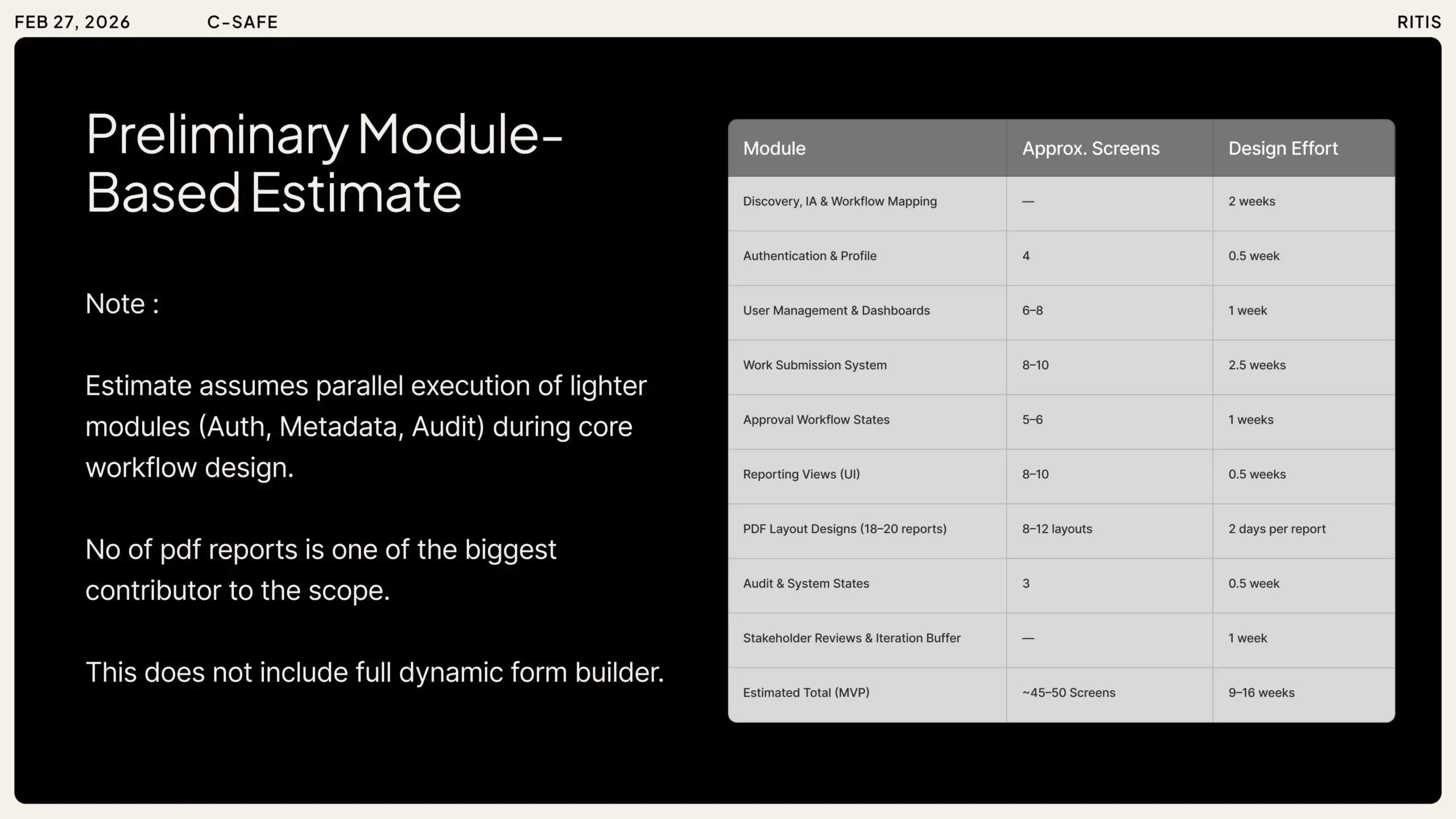
Scoping
4 layers
made the work estimable
shape
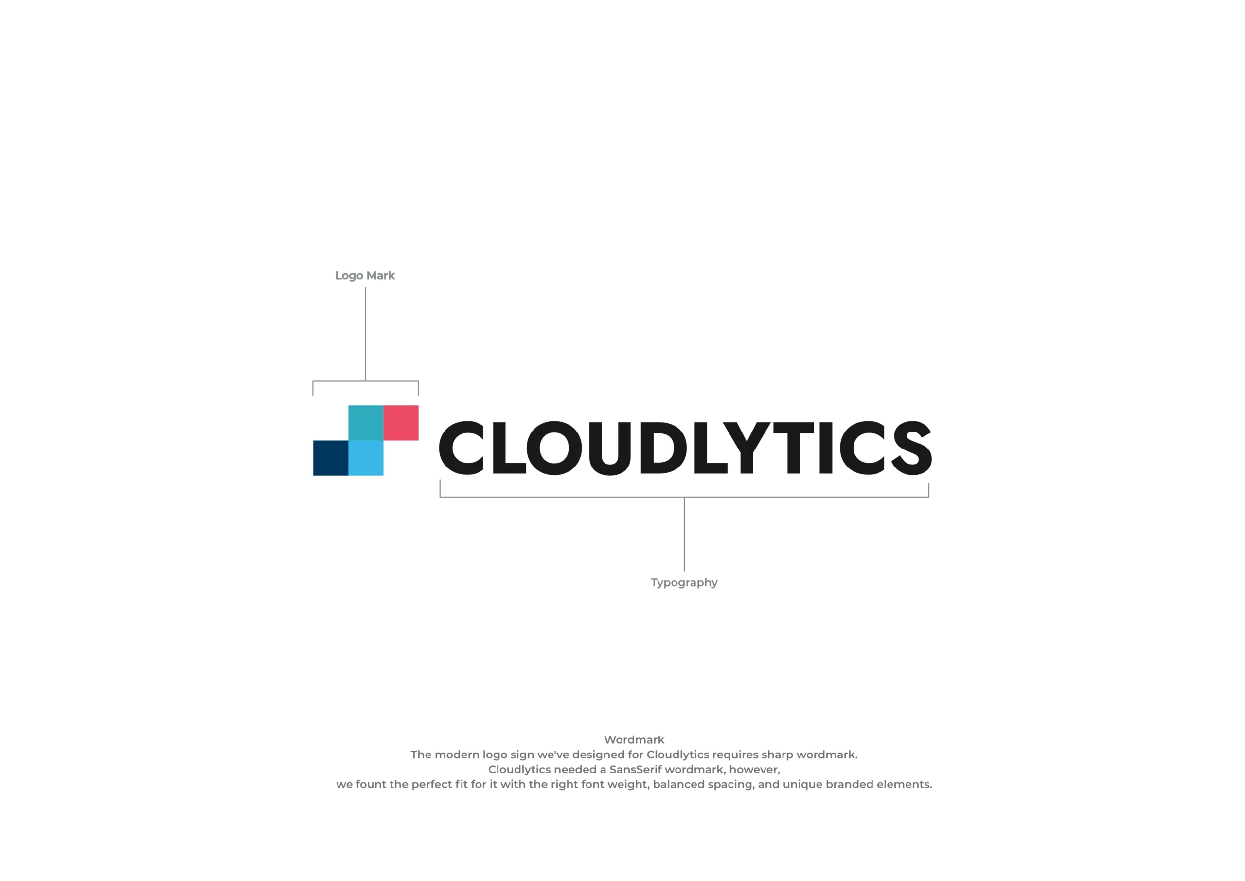
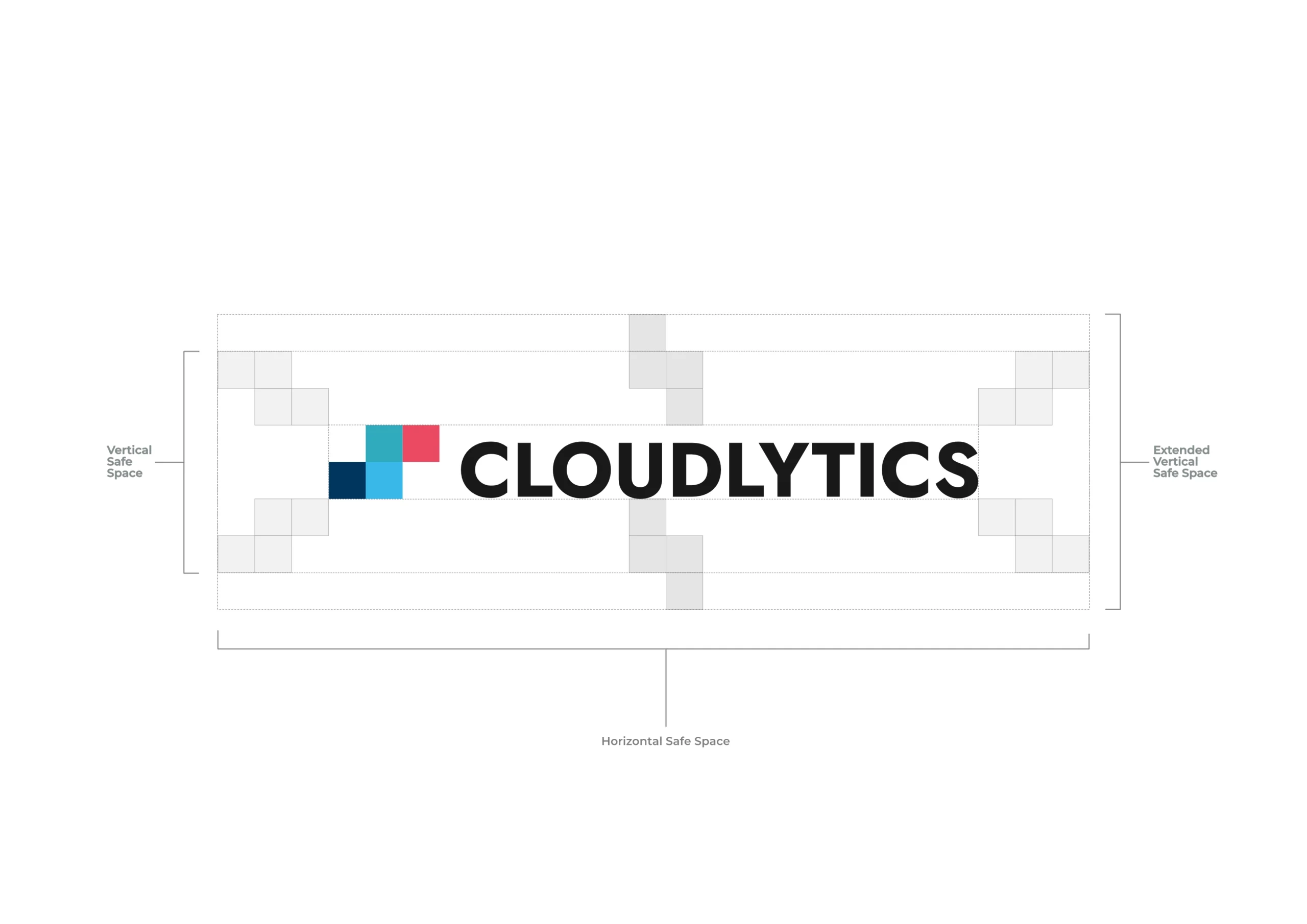
Branding
4 layers
gave the product a face
pitch
Funding deck
2 layers
turned a prototype into a funded project
ship
Handoff
3 layers
engineers shipped without me in the room
SJ
A letter to my next team
You started with one small decision.
SJ
To my next team
Most enterprise software isn't designed.It accumulates.
Ten years of patches.New datasets bolted onto old screens.Every feature request answered with one more button, one more toggle, one more column.
I design for the people who use those tools.Traffic operators, analysts, freight planners.Six years of this work, four of them at a research lab building for state agencies across the US.
The portfolio is a sample.Most of what I've shipped isn't here.The platforms are behind logins, the data is operational, a lot of screens just can't live on a public site.
Here's how I approach it.
I sit with operators before I design.I push on information architecture when a screen feels crowded.I read API docs to find what the spec missed.I draw journey maps when product managers think they don't need one.I prototype to secure funding. I stay through shipping.
An engineering background helps.I know what's cheap to build and what isn't, and I don't hand off work I can't defend in a technical review.
Small team. Hard problems.If that's you, let's talk.